2IP, refreshed: a new design and logo, with the tools you know
We’ve updated 2IP, from the logo and navigation to the way services and check results are presented. The site has a more modern look, while its purpose stays the same: helping you find the tools you need and get information about a network quickly.
2IP has grown considerably over the years. New services, features and tools brought a need for a consistent, convenient interface. Here’s what we changed and the ideas behind the update.
A new logo with speed at its heart
Along with the design, we’ve updated the 2IP logo. The familiar circular mark that represented the site for years has given way to a new one, with lines that suggest movement, coloured accents and the 2IP name.
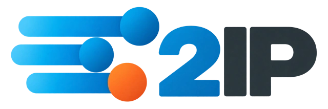
The idea behind the new mark is speed: the speed of an internet connection, and quick access to the information you need.
Checking an IP address, finding domain information, checking DNS or using another network tool can all be done in one place. That quick access to services is what we wanted the new logo to express.
Its lines give a sense of movement, and the compact shape fits the updated interface on both computers and phones.
We’ve also prepared versions for light and dark themes. For the browser tab, we kept just the graphic mark without the name so it remains recognisable at a small size.

The 2IP you know, with a new look
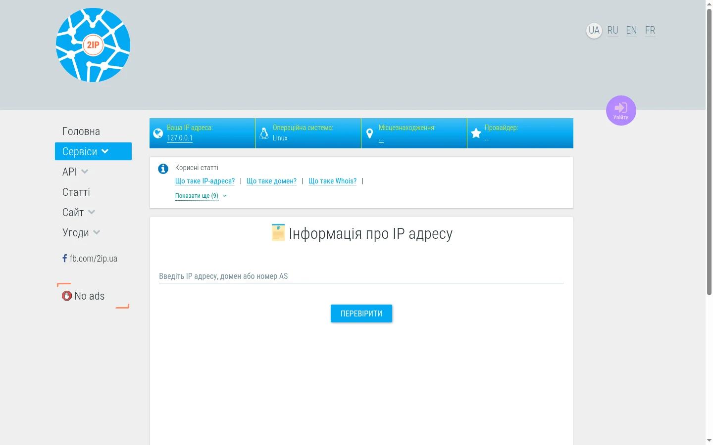
The previous design was with us for years. As the site developed and the number of services grew, individual pages gradually gained their own presentation elements.
We decided to bring them into a shared system so different tools would be equally comfortable to use.
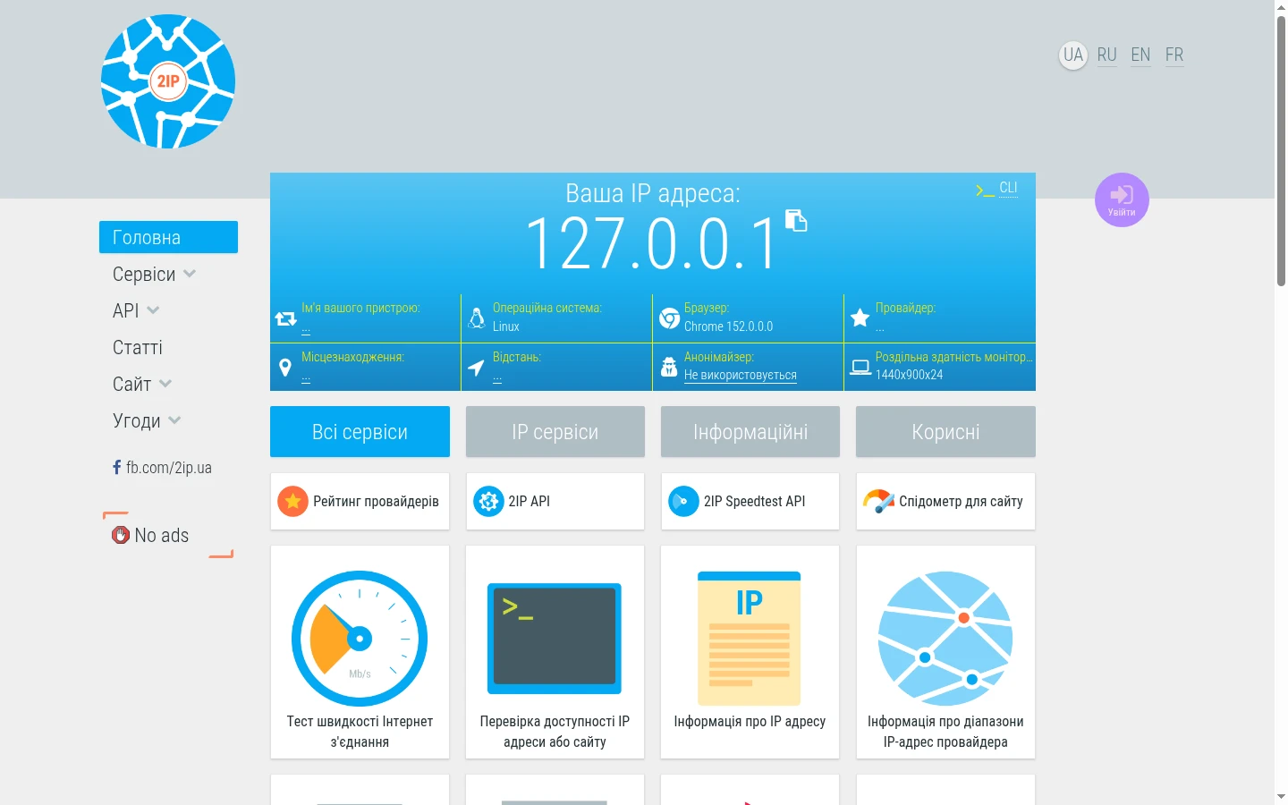
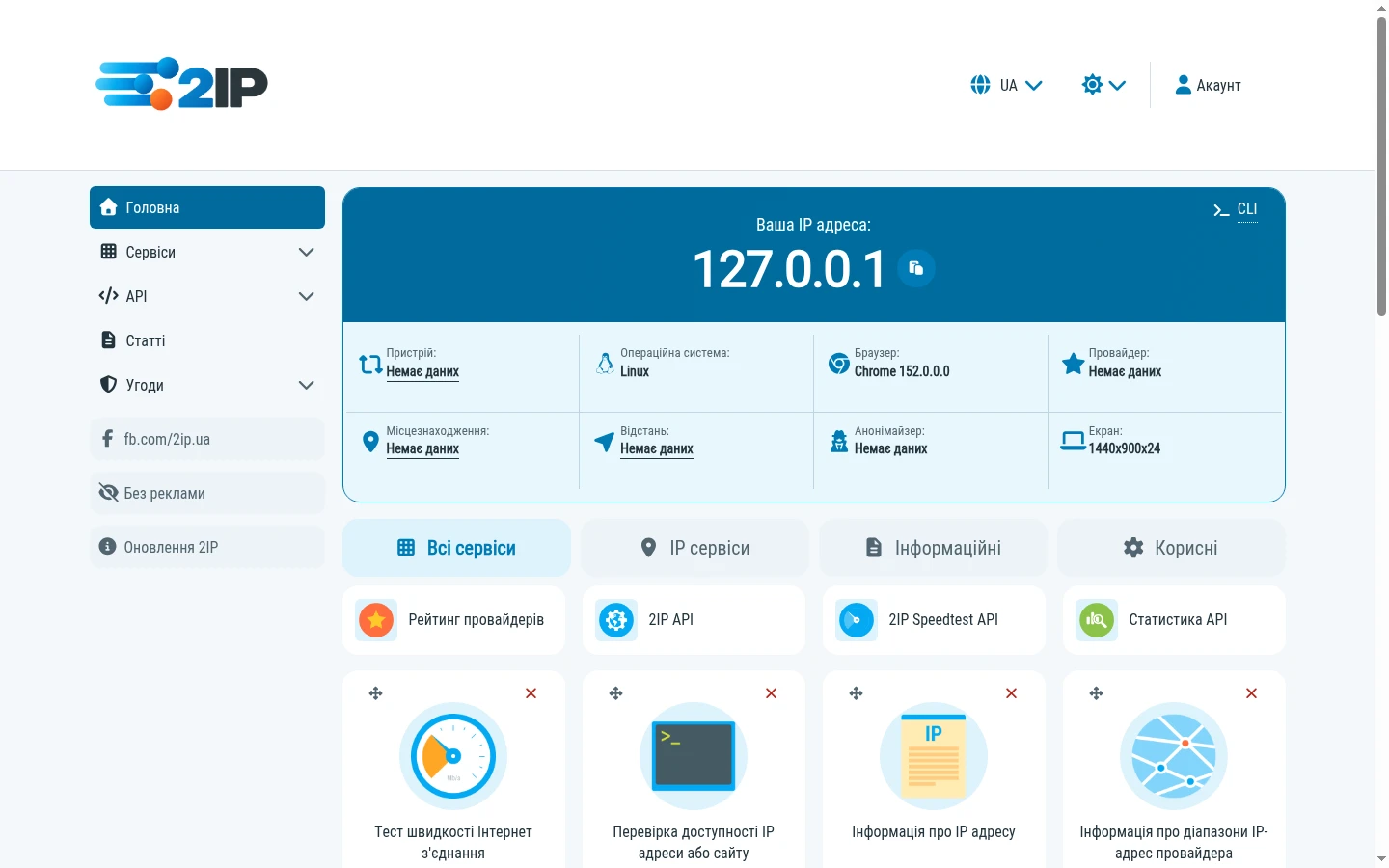
The home page keeps its main idea: your IP address is right in front of you, with the tools you need close by.
We’ve updated the arrangement of blocks, spacing, headings and service cards. Information is easier to browse, and actions are easier to find.
We’ve kept the familiar service icons so regular users don’t have to get used to everything again.
A common style across the services
We based the update on Material Design 3 principles, adapting them to 2IP’s own style.
Buttons, input fields, menus, tables and other elements now follow shared presentation rules.
You notice this when moving between tools. Whether you’re checking IP information, DNS or port availability, familiar controls stay in their places and behave predictably.
We aimed for a consistent interface with a restrained design and no unnecessary decoration.
Easier navigation
With so many tools in 2IP, finding the right one quickly matters as much as running the check itself.
We’ve updated the sidebar, organised service categories and made moving between them more convenient.
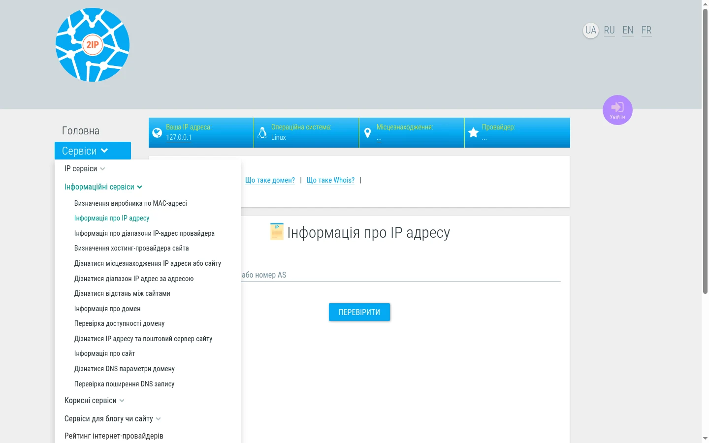
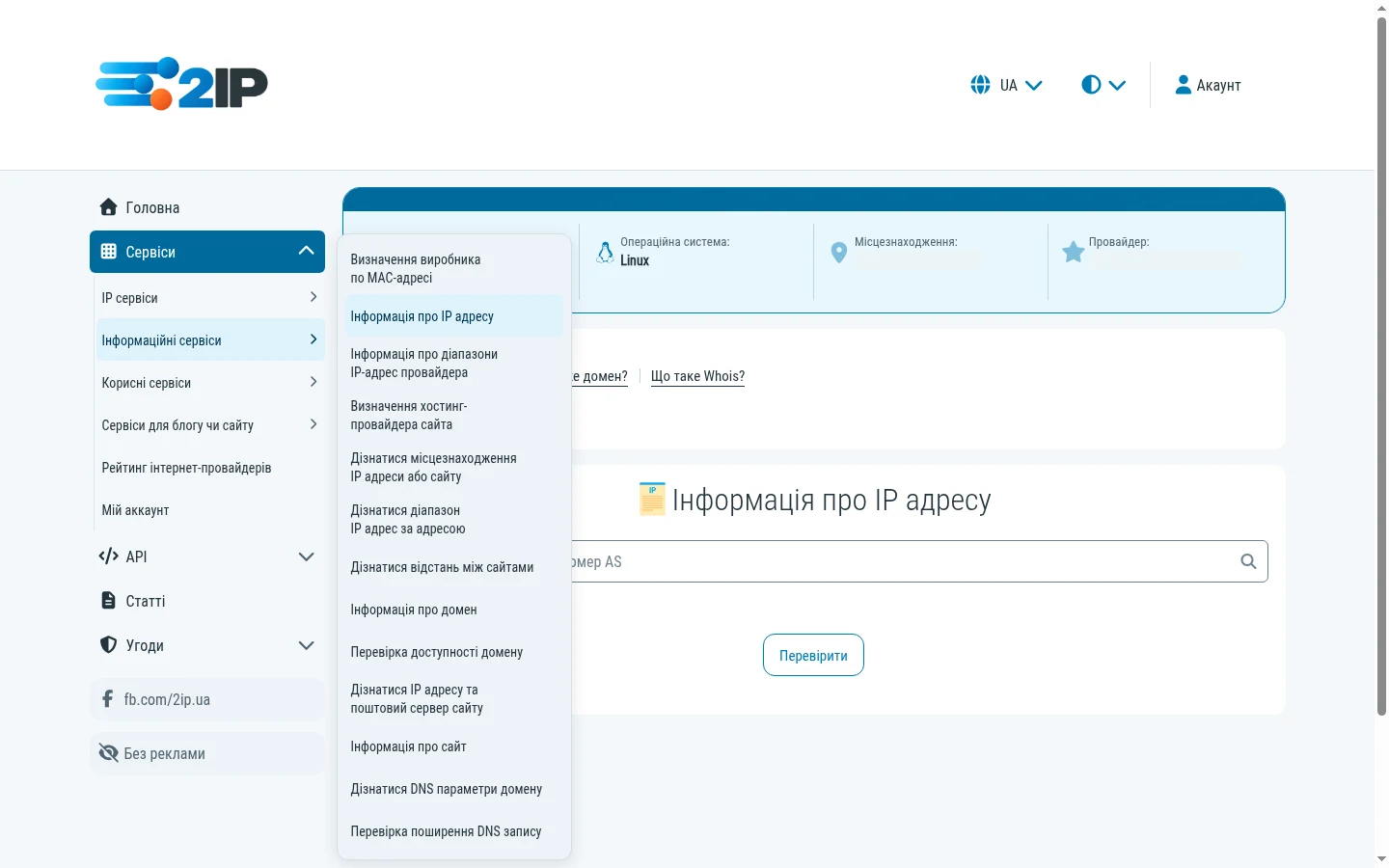
On a computer, groups of tools open in an additional menu while the main sections remain available.
The language and theme selectors, along with access to your account, are now together at the top of the page.
Light, dark or automatic
We gave the site’s appearance in different lighting conditions its own attention.
You can now choose a light, dark or automatic theme that follows your device’s setting.
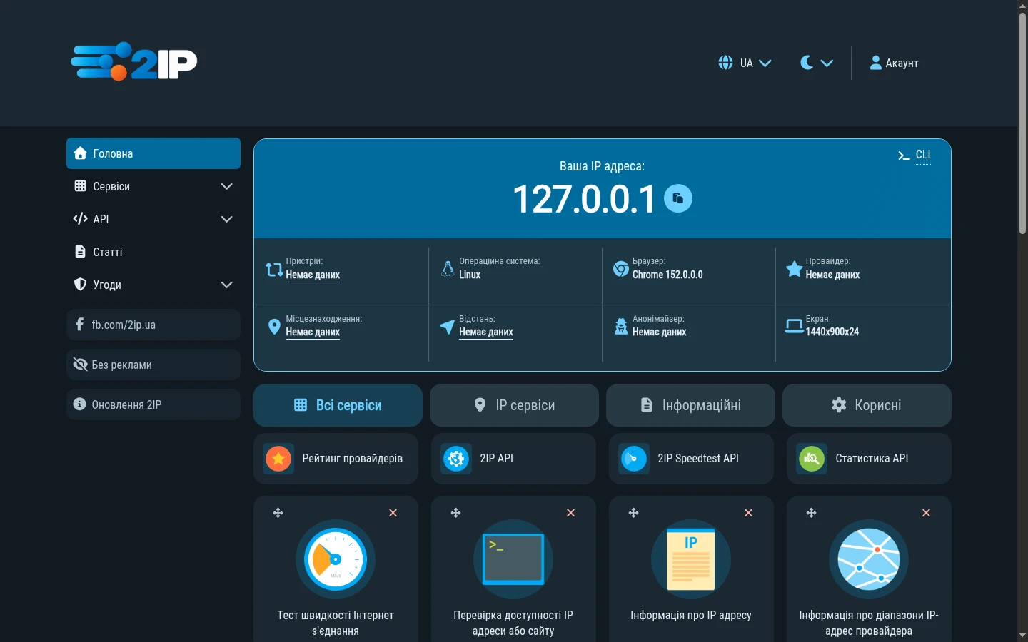
The dark theme has its own colour palette. We chose shades for the background, text, cards and buttons to keep information readable and 2IP’s familiar style recognisable.
Your selected theme is saved in the browser, so you don’t have to set it again each time.
Better forms and clearer results
Most 2IP services start with a simple action: entering an IP address, domain or another value.
We’ve updated fields, labels, hints and buttons to make them more comfortable to use.
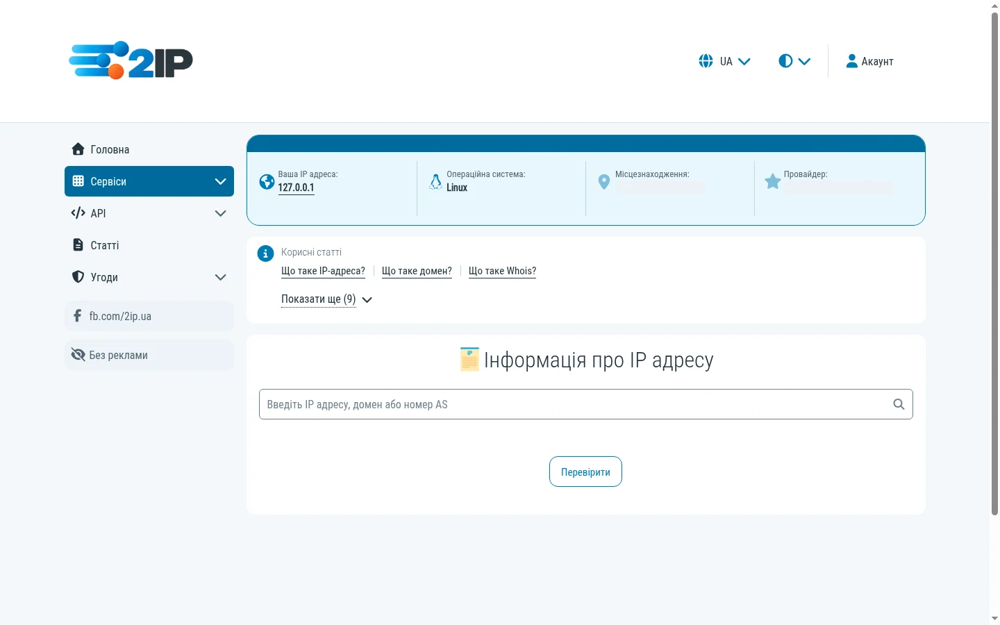
Colours also help explain actions: blue is used for ordinary buttons, green for saving and successful states, and red for errors and deletion.
We’ve also worked on check results. Tables, messages and information blocks now have a more consistent presentation.
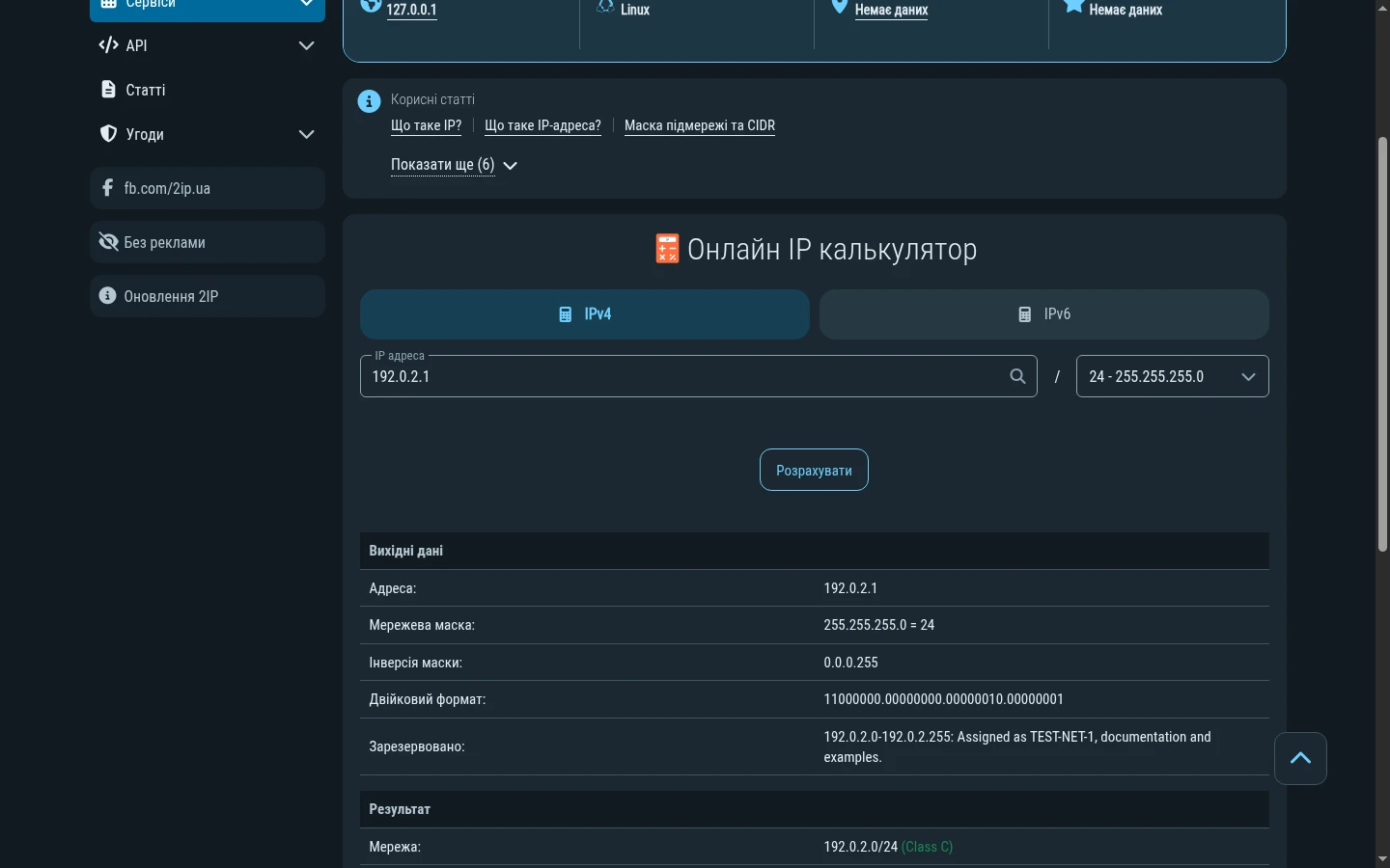
Showing a result also means helping you understand it. A port check might run successfully and report a closed port. That is the check’s finding, rather than a service failing to run.
We therefore distinguish the state of a check’s execution from the information it returns.
2IP on your phone
The mobile version has an updated interface too.
We’ve reworked navigation, enlarged touch areas and adapted cards, forms and results to smaller screens.
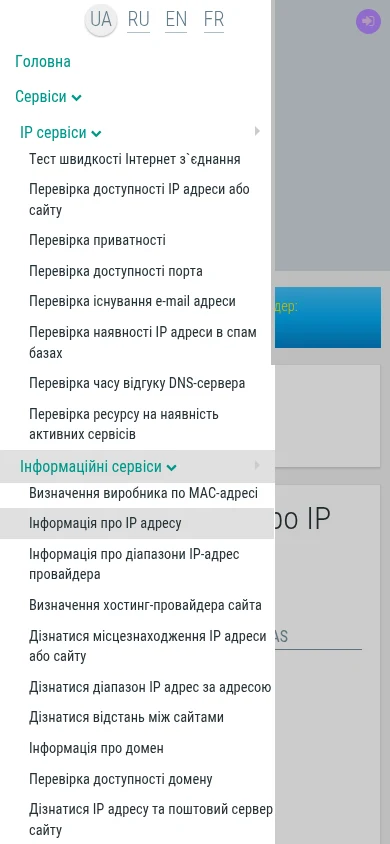
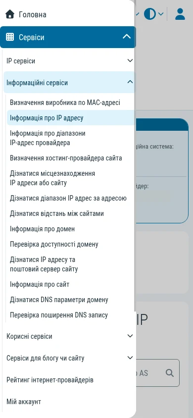
The menu opens in a separate panel, and service categories can be expanded without going to another page.
We’ve also reviewed spacing and the placement of controls to make the tools comfortable to use even with one hand.
Attention to the details
Some changes don’t immediately show up in a screenshot.
We’ve worked on how the interface behaves as well: smooth menu opening, indicators for active controls, keyboard navigation and page stability while loading.
We’ve paid attention to keeping controls in place when there is no need to move them and making theme changes smooth.
These small improvements make everyday use of the site more comfortable.
The essentials stay the same
Through all the visual changes, 2IP’s purpose remains the same: helping you get network information quickly and use tools to check it.
You can still see your IP address straight away, check DNS, find domain information through WHOIS, check port availability and use dozens of other services.
We’ve updated the appearance and kept what you value in 2IP: simplicity, speed and access to the tools you need in one place.
What comes next
2IP keeps growing. The new design gives us a foundation for future updates, new features and improvements to our services.
We’ll keep working to make 2IP easy to use, fast and reliable for your everyday tasks.
Thank you for using 2IP and growing with us!